Overhauling dated systems
Overhauled web, product, and process design for the Hawaii Public Housing Authority.
- Client
- Hawaii Public Housing Authority
- Role
- Project Lead
- Status
- Shipped
- Year
- 2021
01
The challenge
Forge partnered with the University of Hawaiʻi Department of Architecture to conduct UX research to understand the needs of residents living in public housing. Impressed with the initial report, the Hawaiʻi Public Housing Authority asked Forge Studio for help updating their website.
02
Reframing
In the process of understanding their needs, scoping the work and learning about their existing tools, we agreed, on the condition that we could also help modernize the core platform running their organization. Modernizing meant respecting real constraints in a public-sector environment, and navigating internal processes that frustrated both staff and the residents they served.
03
Scope
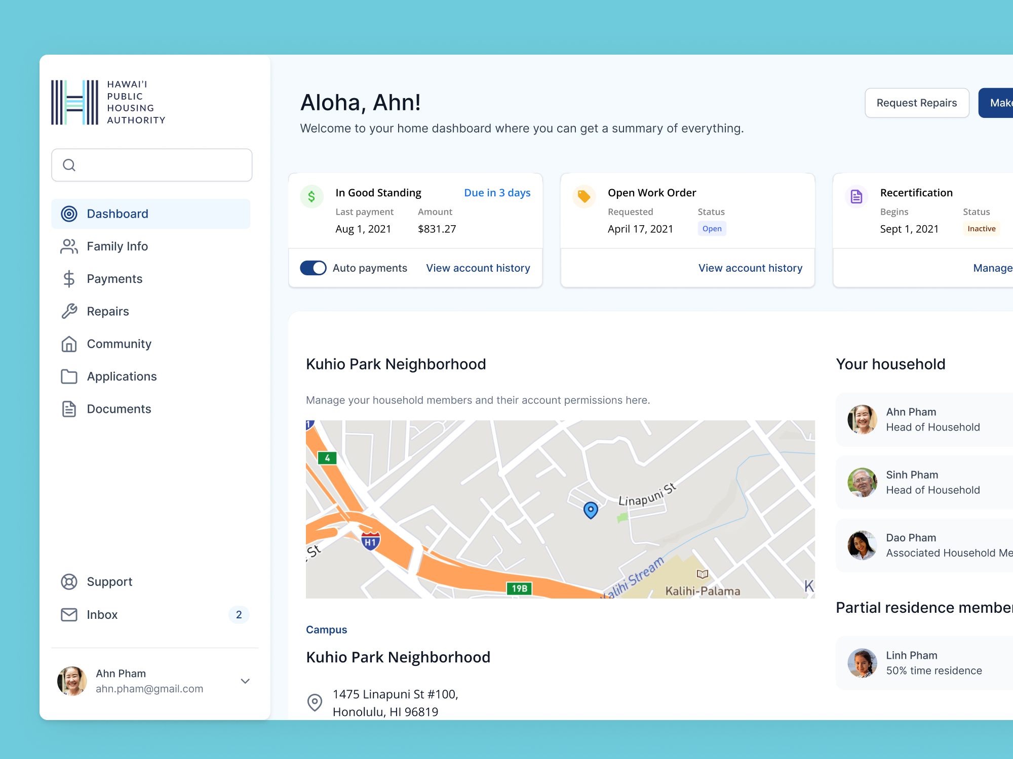
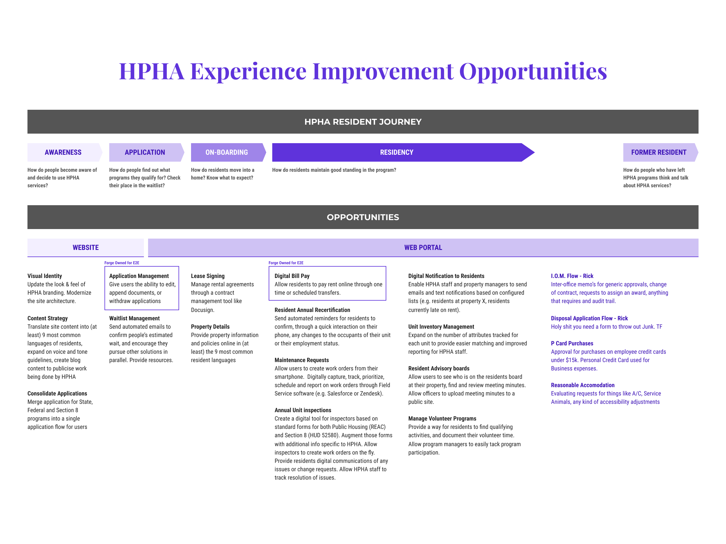
The scope was the whole resident relationship, not a single screen. I mapped the resident journey end to end, from first awareness through application, onboarding, residency, and life as a former resident. At each stage I marked where a public website and a logged-in portal could remove friction, which gave the team one shared map of what to build and in what order.
04
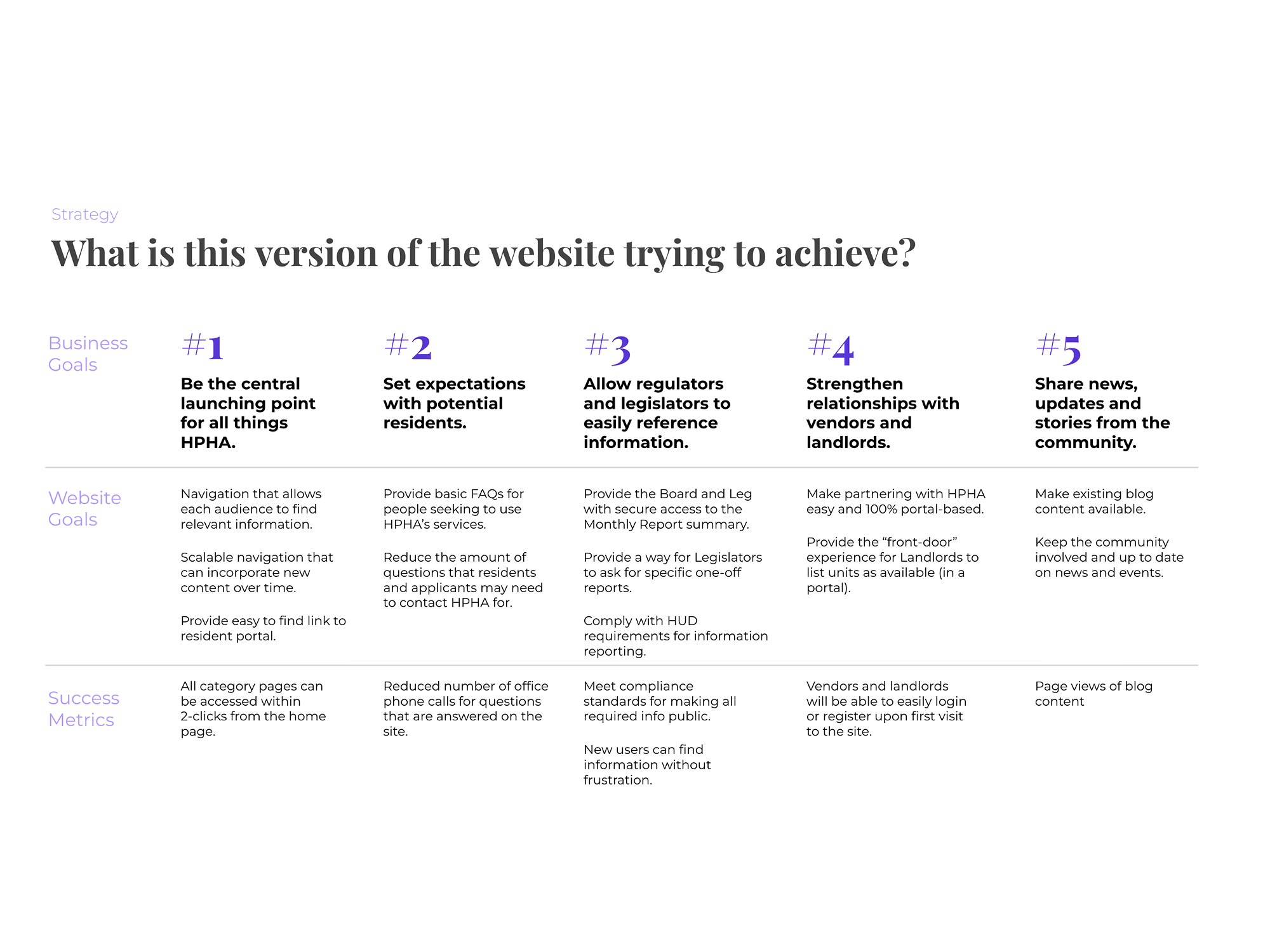
Project goals
Before any design, we agreed on what success meant. I set five goals, each tying a business outcome to a concrete job the website had to do and a result we could measure, from being the central launching point for all things HPHA to sharing news and stories from the community. Naming the metric for each one kept scope honest and gave us a way to tell whether the rebuild actually worked.
05
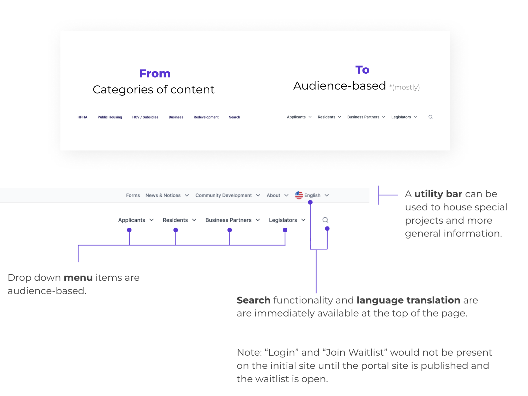
Nav updates
Navigation had to serve very different people: applicants, residents, business partners, and legislators. I restructured the top nav around those audiences instead of HPHA's internal org chart, and pulled search and language translation up where everyone could reach them. A utility bar made room for special projects without crowding the main path.
06
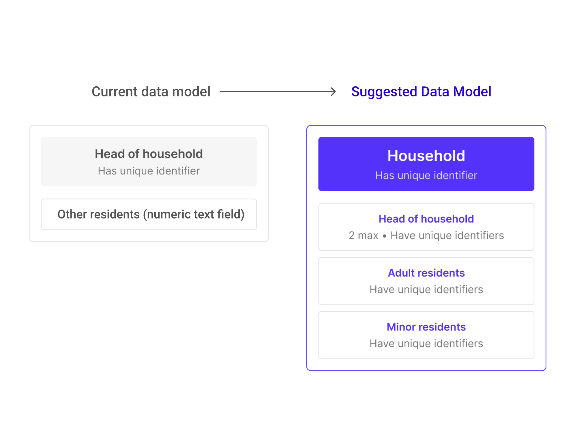
Data model improvements
Some of the hardest problems were in the data, not the screens. The existing model treated a unit as a head of household plus a count of "other residents," which made basic questions impossible to answer. I proposed a Household structure with a unique identifier for every resident, so HPHA could finally report on things like how many households include elderly residents, and track history as families change over time.
07
Results
We shipped a beautiful, well-organized, multilingual site to serve residents, HPHA administrators, and policy makers. Even years later, the site looks very similar to launch, a testament to successful planning for maintainability.