Coaching other leaders
Introduced design systems and project scoping tools at Financial Health Network.
- Client
- Financial Health Network
- Role
- Consultant
- Status
- Shipped
- Year
- 2021
01
The challenge
Financial Health Network came to my agency, Forge Studio, looking for help merging two websites. Their event site, emerge.fhn.org, had quietly become a second platform of its own. The UX director didn't only want support in planning the migration, she wanted her team stronger on the other side of it. They already had a strong engineering partner, but were learning they lacked some skills and tools to be a good partner in scoping and planning digital design projects. I shaped a different kind of engagement, where we would teach by showing. We would run the project together and leave behind the tools and examples for Product and Project management they could reuse to guide future work.
02
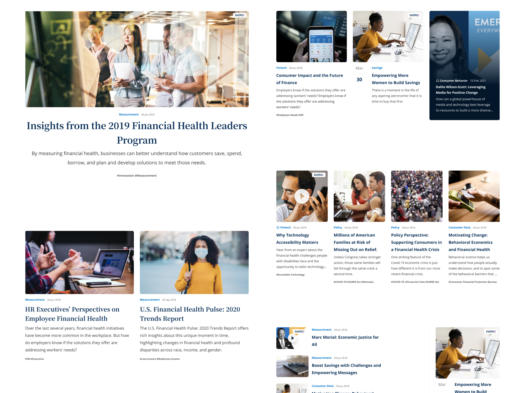
User segments and task analysis
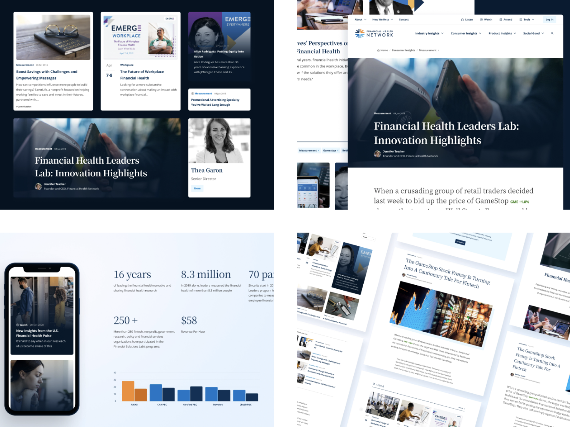
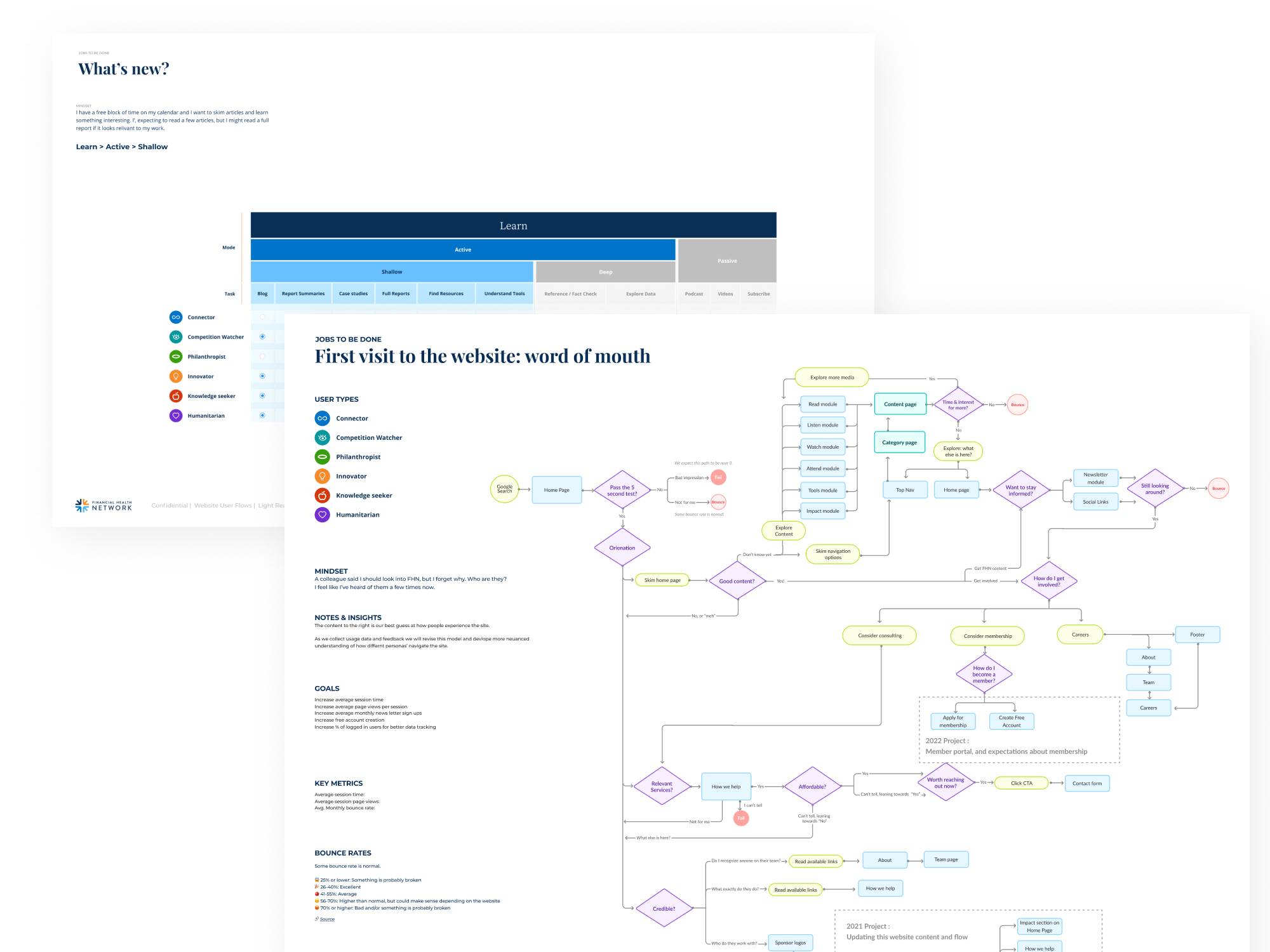
FHN had a deep and nuanced understanding of their customer segments. What they hadn't mapped was how each segment actually used the sites, what content they came for and how they moved to find it. I started there, tracing task flows by user type across both websites to find the paths that mattered most and the places people fell between the two.
03
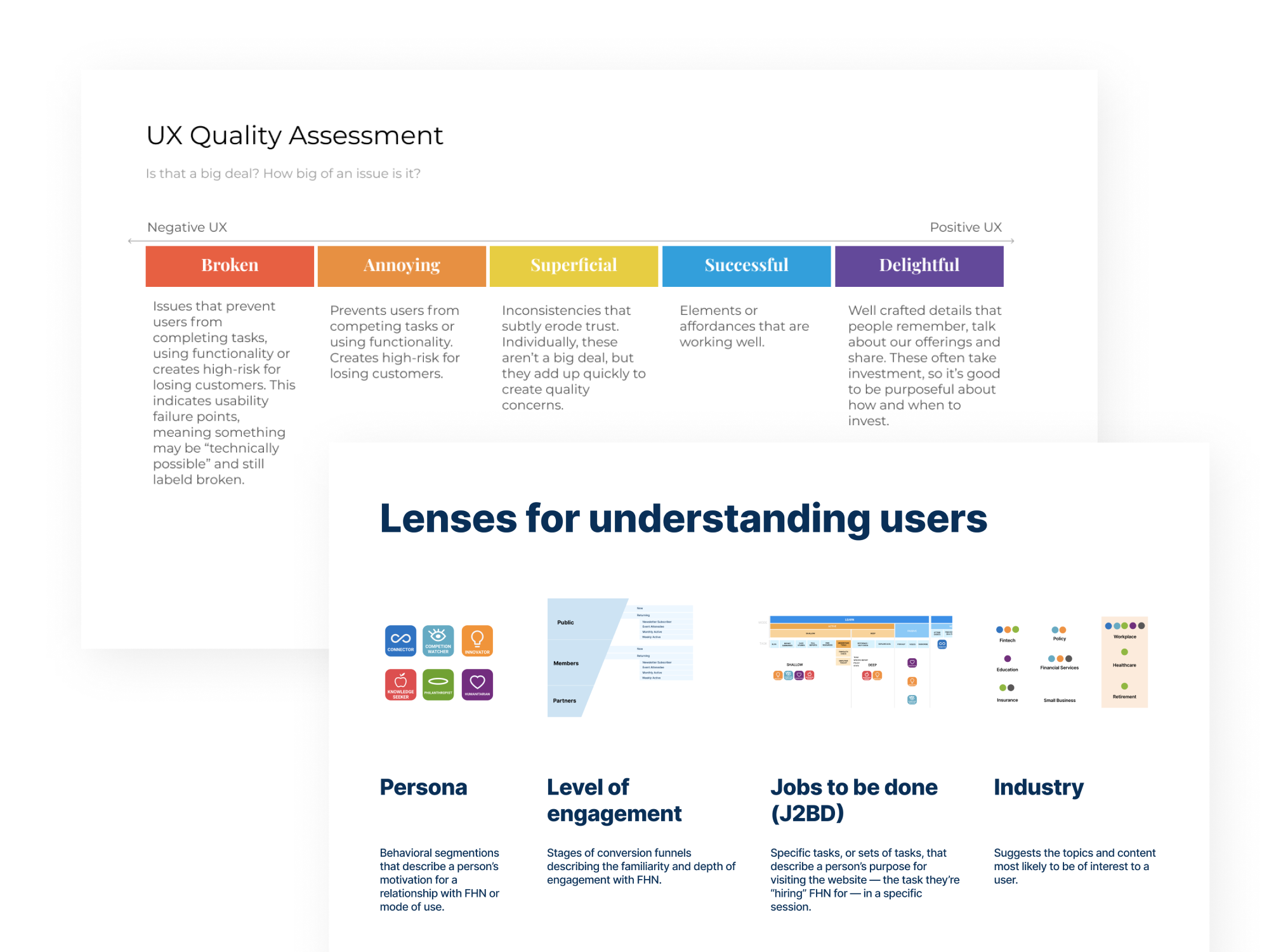
Prioritization tools
Before redesigning anything, I mapped what was and wasn't working on the current sites, scoring quality and marking the moments of delight worth keeping against the friction worth fixing. I added a shared set of lenses (persona, level of engagement, jobs to be done, industry) so the team could read users the same way every time. It gave them a repeatable way to separate what to keep from what to rebuild, on this project and the next one.
04
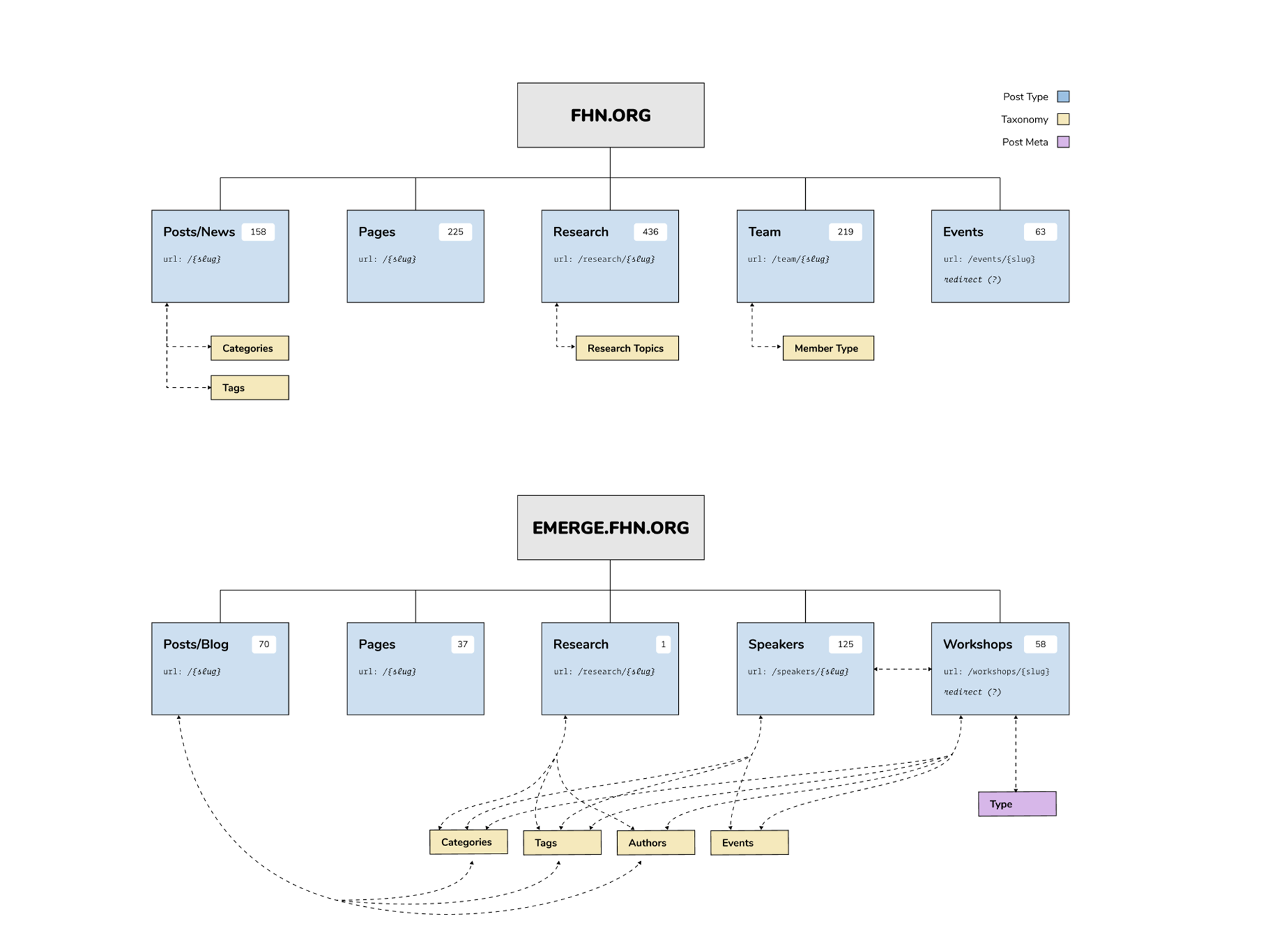
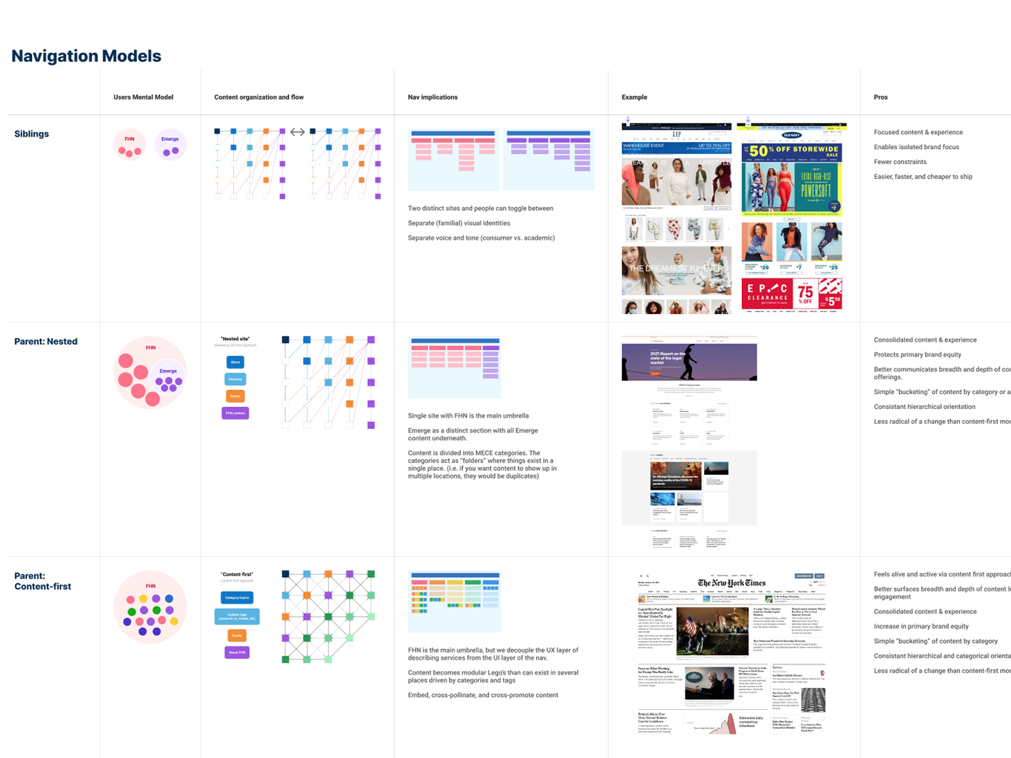
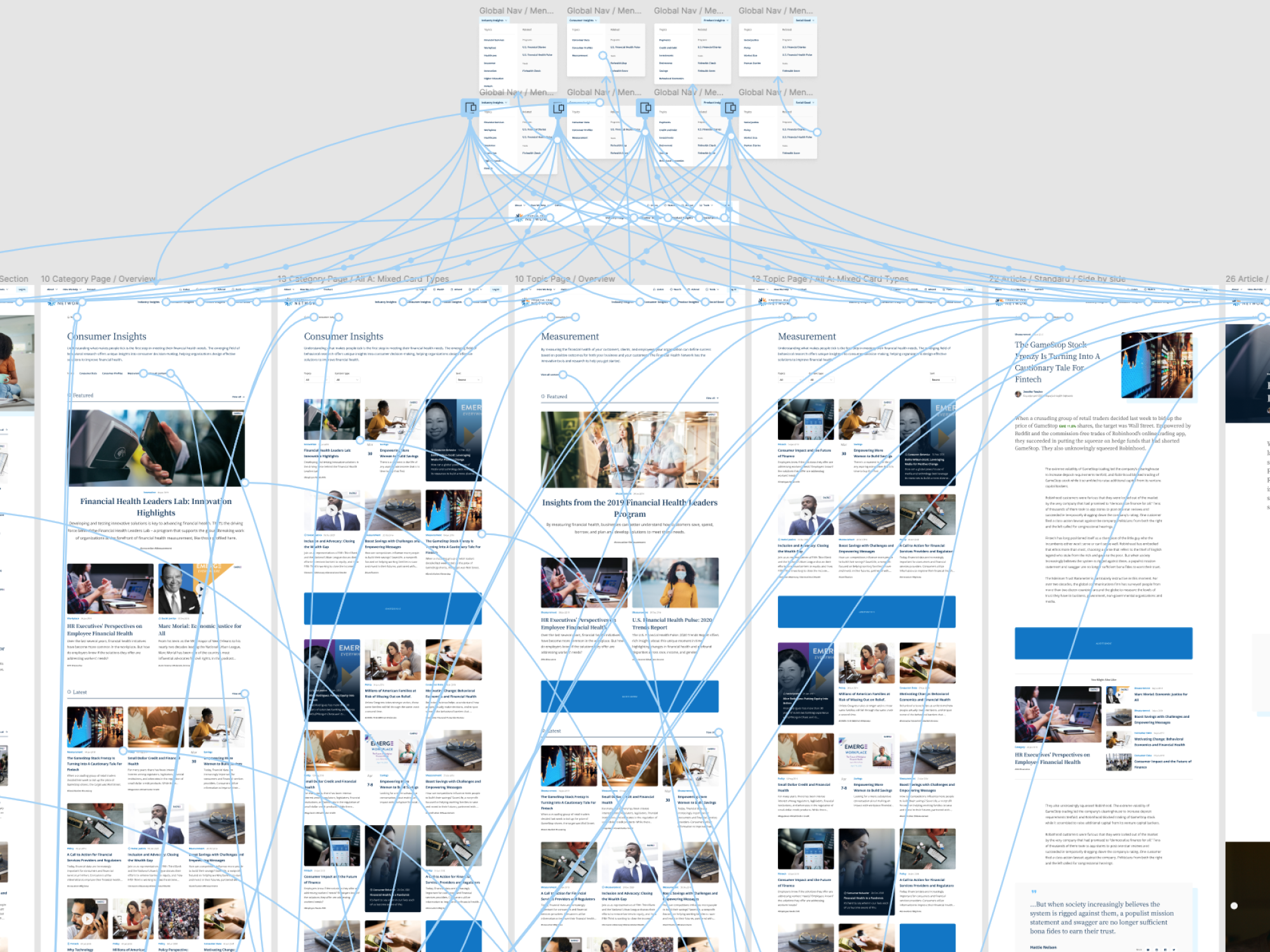
Navigation models
Merging two brands is a strategic decision before it's a design one. I built mental-model diagrams to lay out the strategic options (siblings, parent-nested, parent content-first), each with its tradeoffs drawn out. The diagrams did the real work in the room. They let stakeholders at any technical level see the pros, the cons, and the downstream implications of each path, and decide with their eyes open.
05
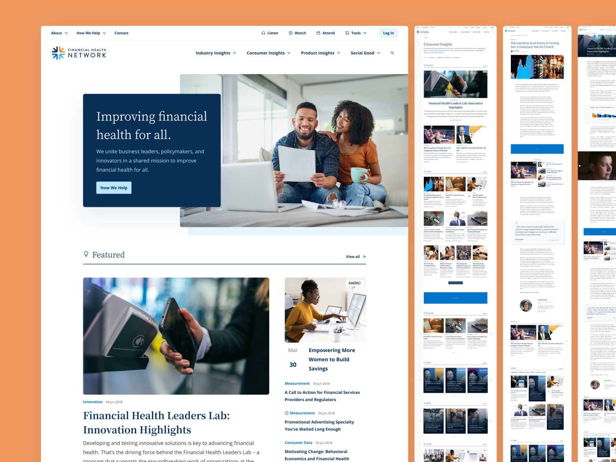
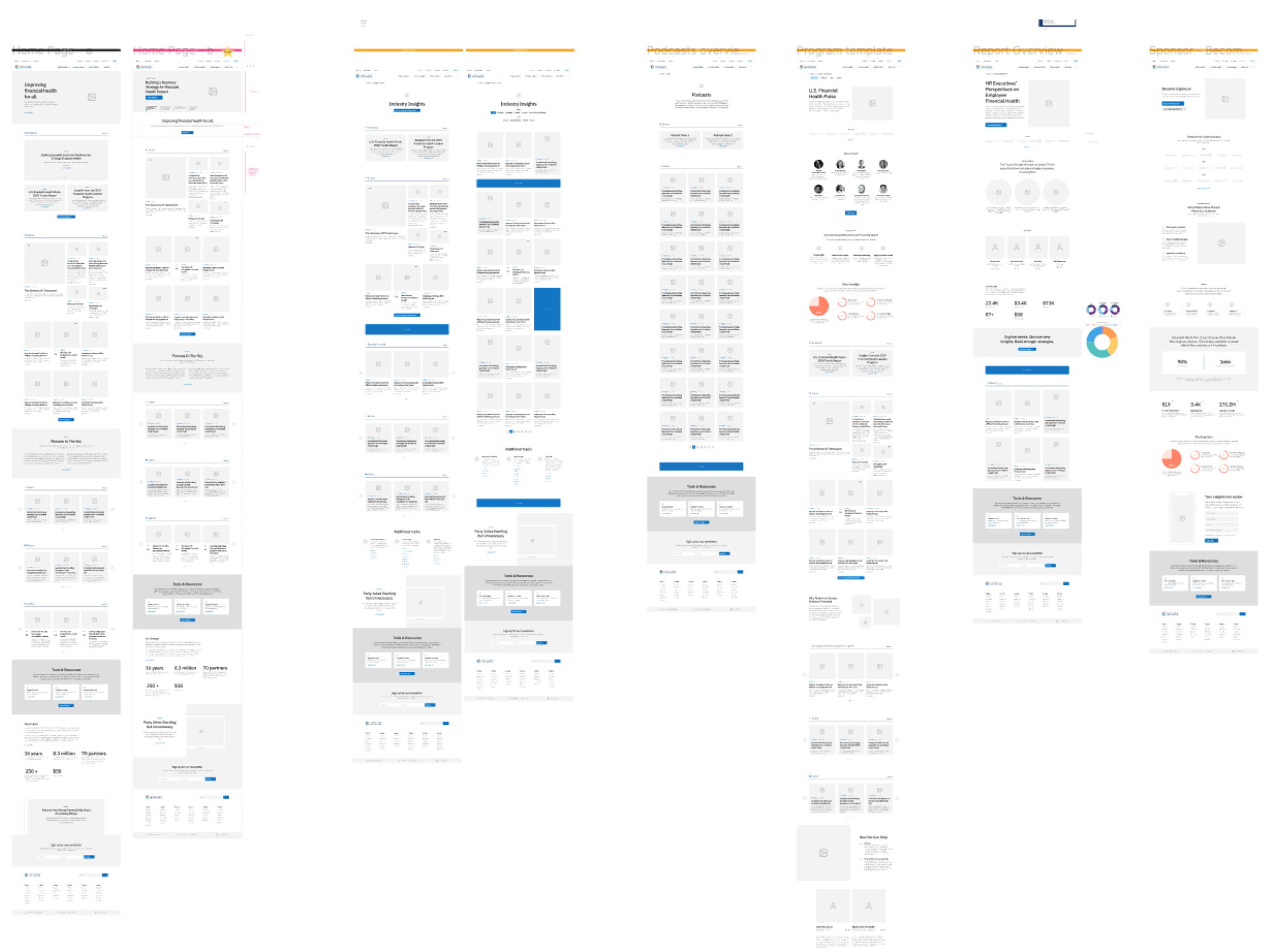
Key pages
We mapped the key page templates and, for each one, catalogued the components it would take to build it. That inventory became the foundation the whole system was built from.
06
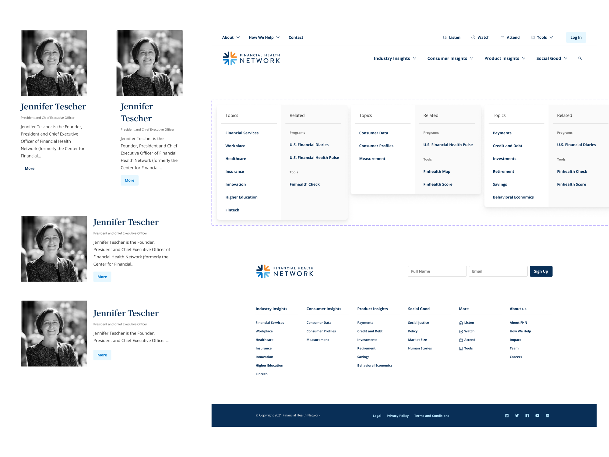
Key components
Then we turned each component into a configurable set of variants and showed the FHN team how those components actually behave. The point was versatility. An author card that appears in a dozen contexts can be one component, built once and reused across both sites and every template. We designed for scale, how a thing gets reused, not just how it looks on one page.
07
Testing in context
A component library looks clean until real content hits it. We dropped in real photos and copy to pressure-test the system, truncation, header placement, the cases that break a tidy design. Better to find them here than in production.
08
Prototyping
This was before AI prototyping, so a designer wired up the prototype by hand, and it was worth it. The team could play with the look and feel and socialize the investment internally before engineering committed to building it. People could feel what the site would become, which is what turned a budget line into a decision everyone backed.
09
Results
We merged the two sites on time, ahead of FHN's EMERGE event. That was the deliverable. The lasting part was everything else: a team that understood web design best practices, a stronger relationship with their engineering vendors, and reusable tools for prioritization, scoping, and stakeholder management. I came in to merge two websites. I left them able to run the next one themselves.